Our aim with the re-brand of the North West 200 was to create a consistent look for the historic event – a brand that will stand out by itself as well as be easily used and replicated across multiple mediums.
The problems:
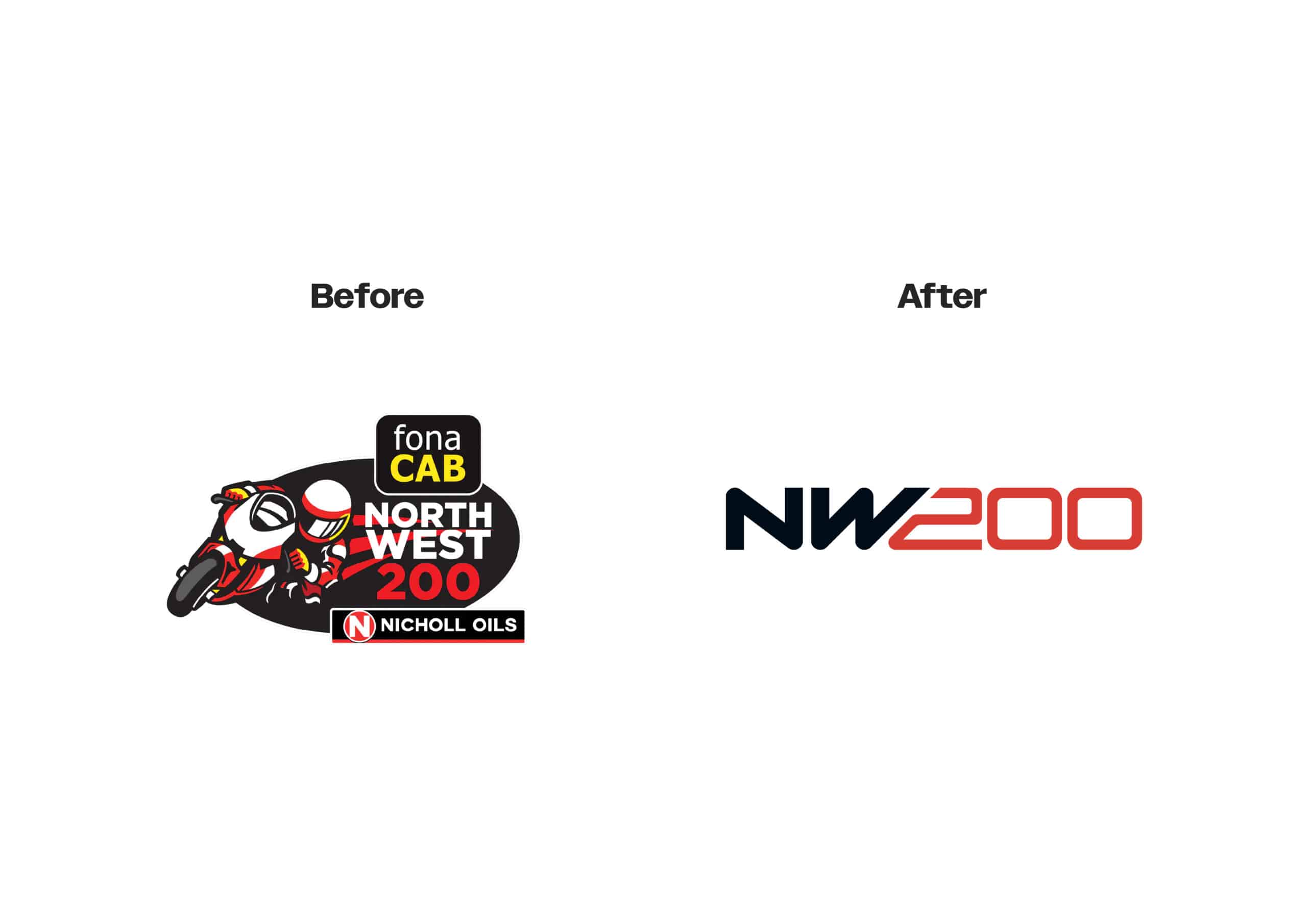
- A logo that combined sponsor logos which had to be recreated/adapted most years. This resulted in not only issues in logo application but a lack of consistency for the event branding as well as out-of-date promotional material year after year.
- Bright and bold website colours that look great online – but don’t translate well to print materials. This caused a lack of consistency and strength the brand.
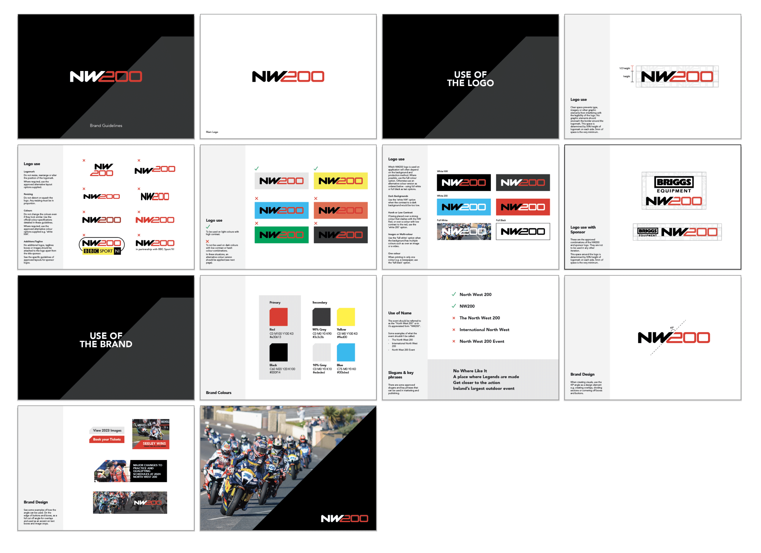
Creating a recognisable logo
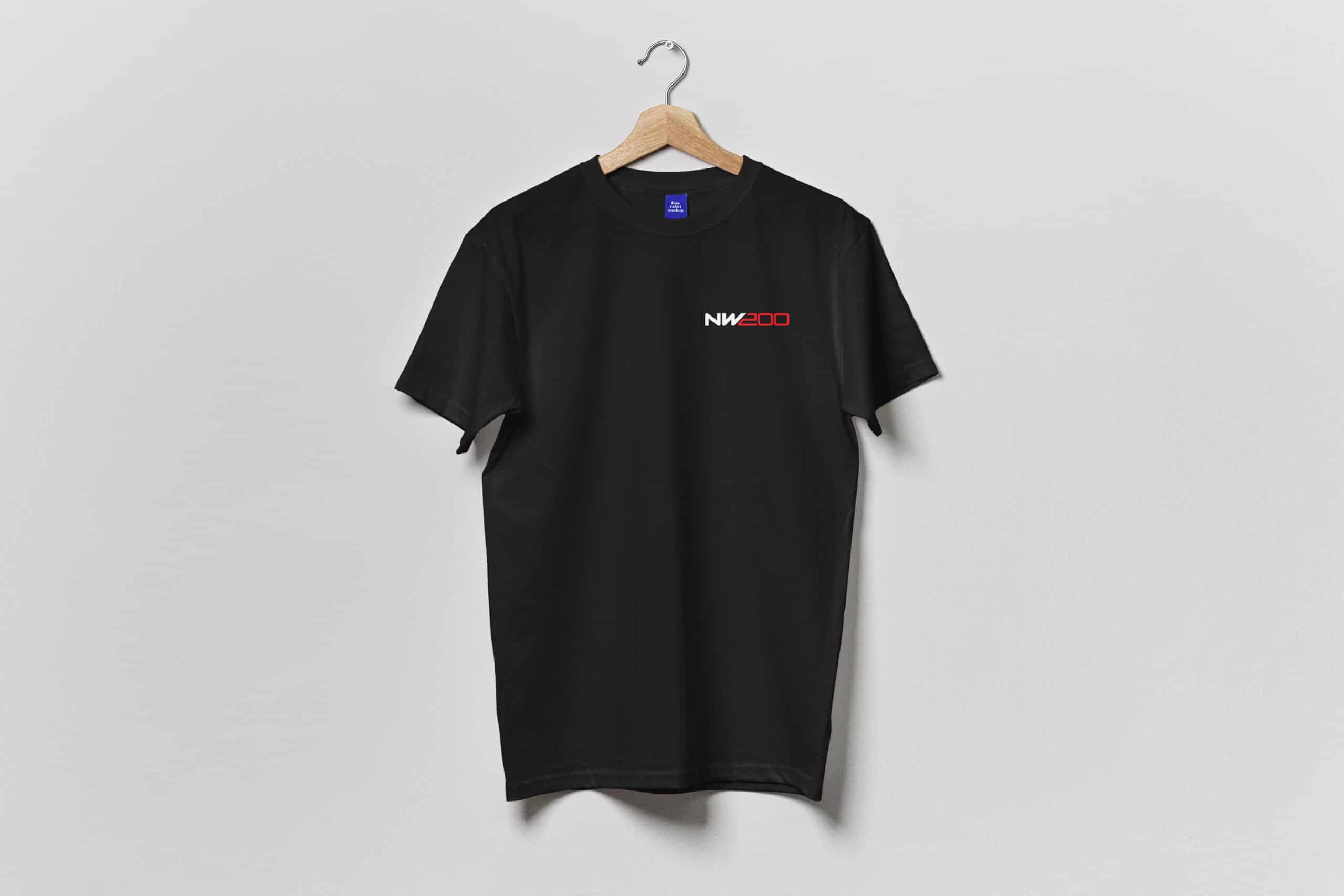
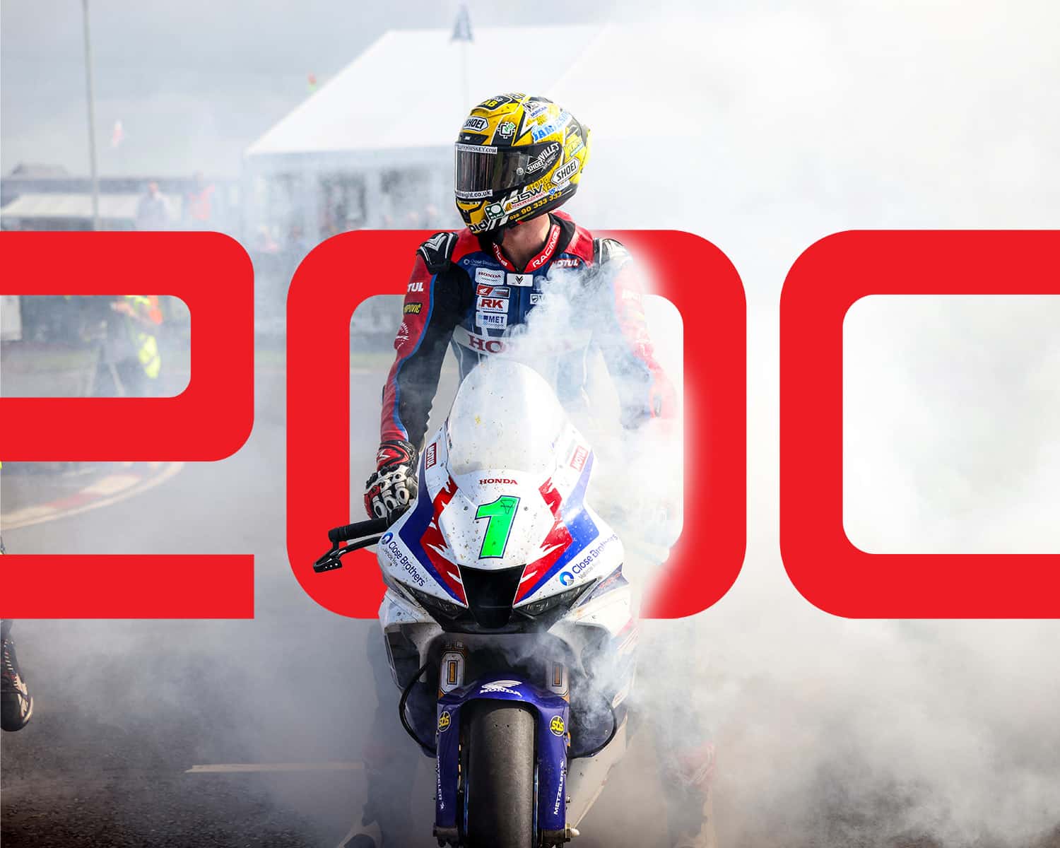
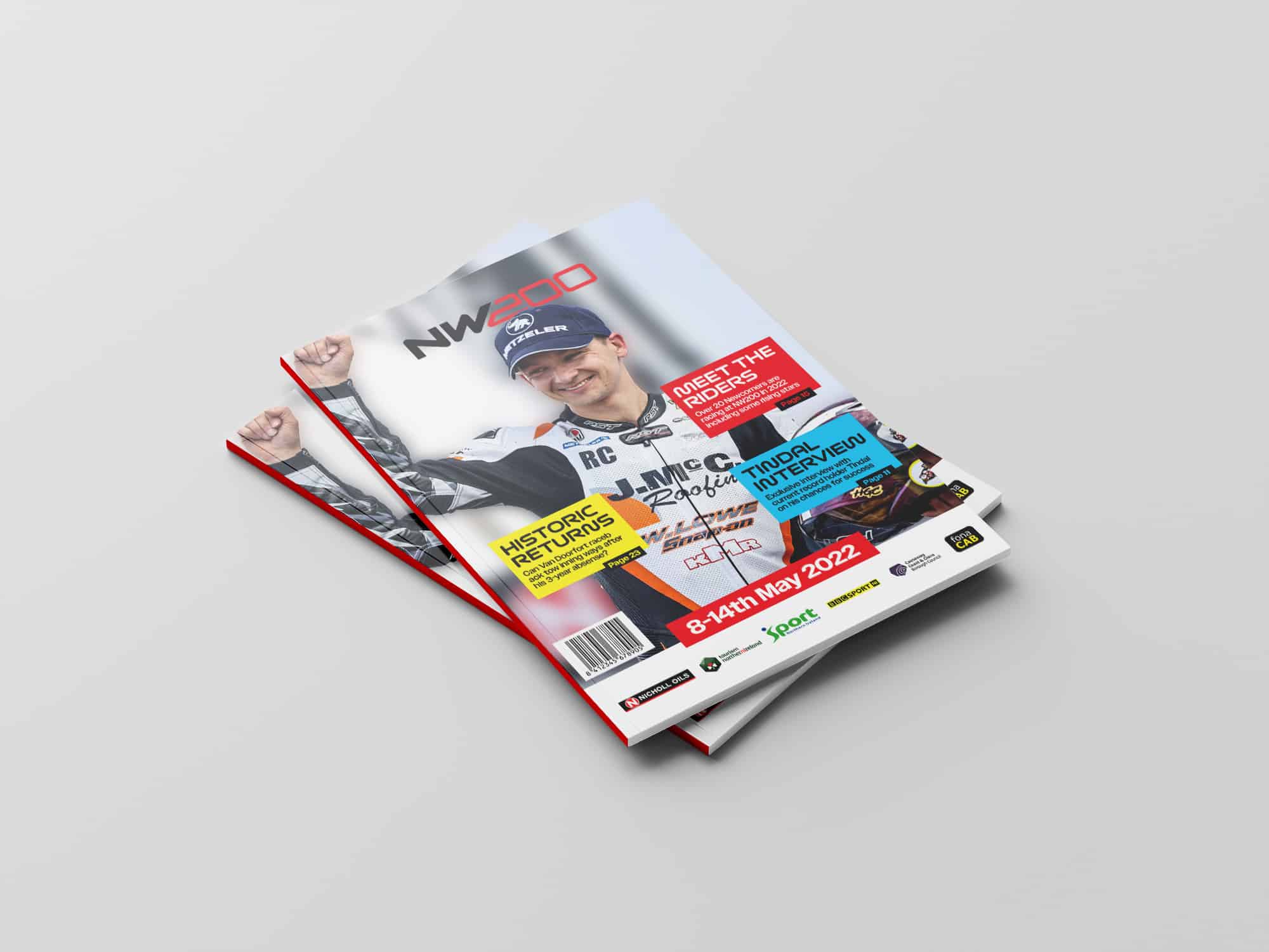
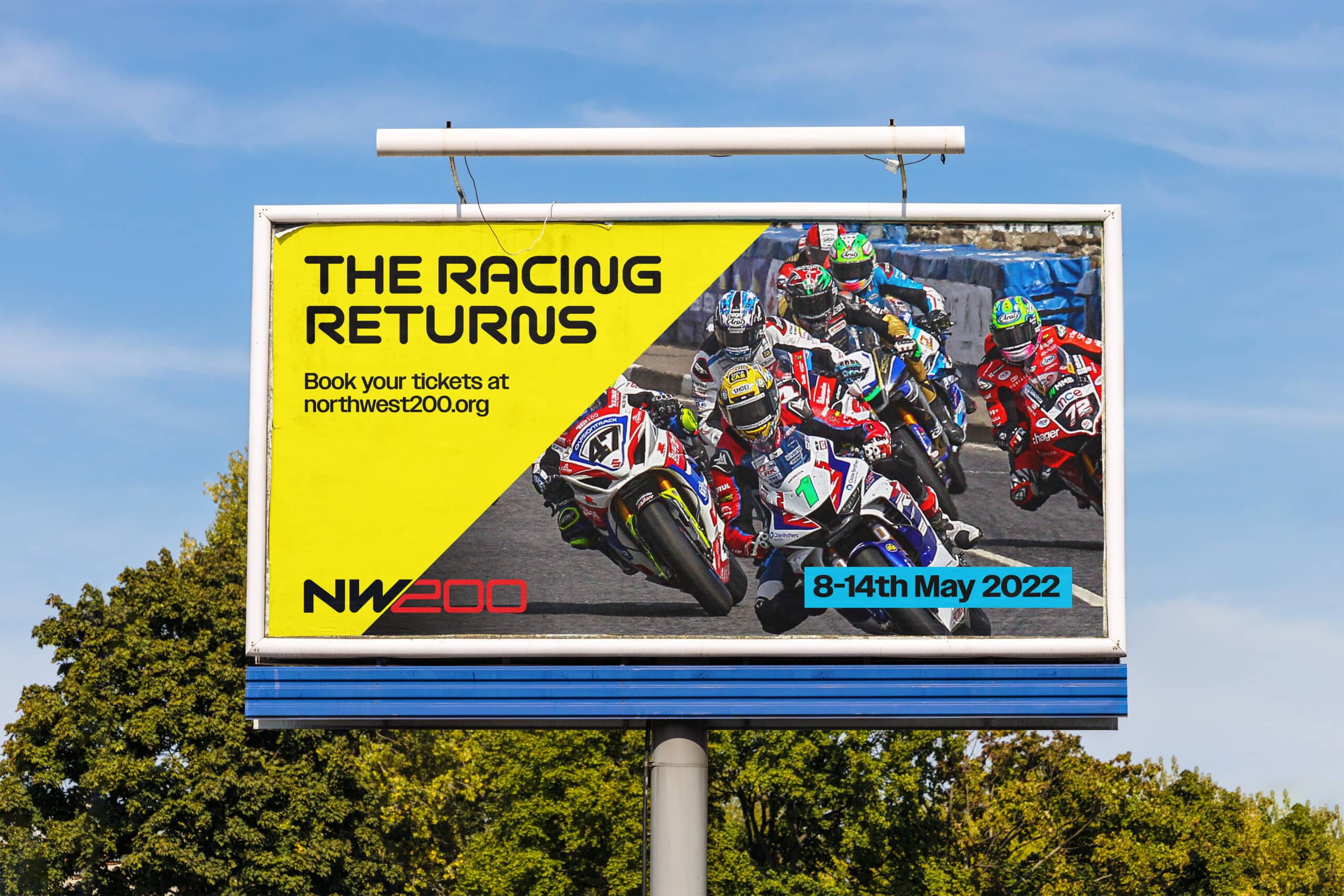
Central to our update is a new NW200 logo, crafted to represent the event’s speed and tradition while standing strong on its own. This versatile logo integrates seamlessly with partner branding, ensuring consistency and building on recognition each year.
Modern, Clean and Bold Branding
Our design approach focuses on modernity and clarity. We’ve chosen typography and colours that feel both current and energetic, creating a visual identity that’s fresh and engaging. Inspired by motorbike racing, the logo and branding have many elements integrated into the design from the sport. For instance, the 45-degree angle crafted into the logo is reflective of not only the speed of the bikes, but the lean experienced by riders as they turn the tightest of corners. This design identity is then further explored across designed elements – in background overlays, content boxes and CTA buttons.
Guidelines for Consistency
To maintain a cohesive brand presence, we’ve developed clear usage guidelines for the NW200 logo. These guidelines help partners to showcase the brand effectively across various platforms, ensuring a unified visual identity. This will ensure the longevity of the logo and ensure that the brand identity’s strength is maintained when shown with other sponsor logos.
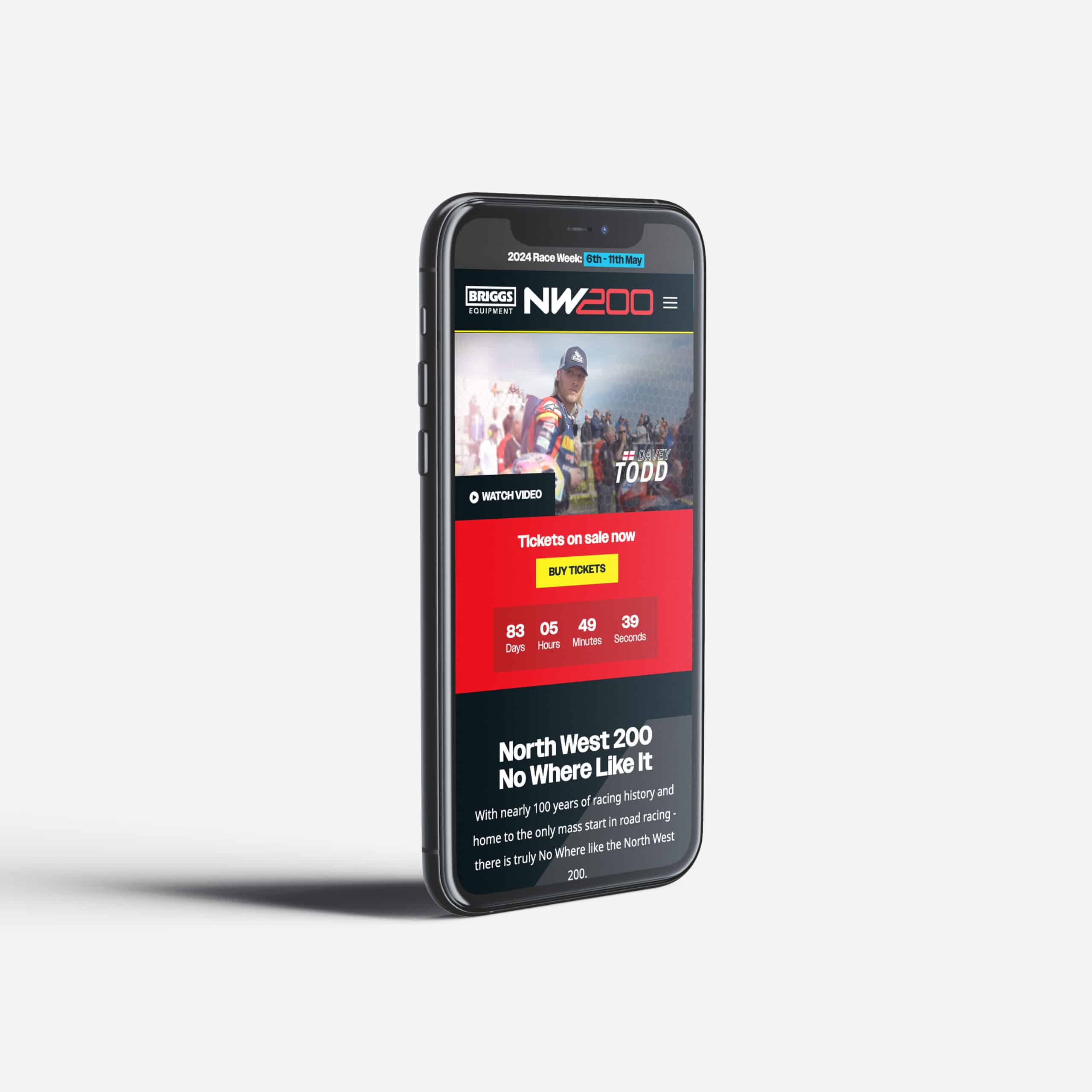
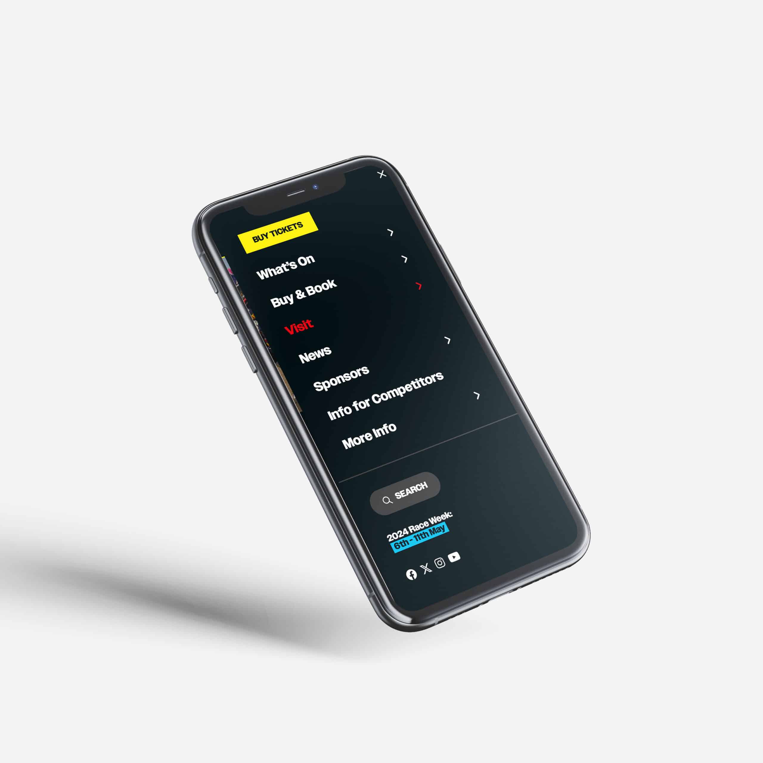
A data drive website refresh
In addition to our branding efforts, we’ve revamped the North West 200 website to provide a better user experience:
- Data-Driven Optimisation
By analysing user behaviour, we’ve optimized the website to highlight the most visited pages at different times of the year. This ensures that you can find the information users need quickly and easily.
- Enhanced Calls to Action
We’ve implemented clearer calls to action throughout the website, making it easier for users to purchase tickets, book VIP experiences, and more.
- Optimised for Mobile
The design is mobile-optimised with a new navigation system and easy-to-find CTAs.
Looking to revamp your branding? Get in touch with us today.